<Field>
Primary element for data input based on React-bootstrap Form controls. Field element automatically handles all the data binding with the Redux Store and supports JSON schema definition.
Schema
#const reducer = utReducer('react-example/fields', {
init: {
isEdit: true,
isRow: 'top',
fields: {
name: {
type: 'text',
value: 'abc...'
}
}
}
})
init: {
isEdit: true,
isRow: 'top',
fields: {
name: {
type: 'text',
value: 'abc...'
}
}
}
})
isEdit: boolean
It controls whether all the fields are:
- true: editable
- false: readonly.
isRow: string
It controls the position of field labels where:
- ‘top’: on top of the field input
- ‘left’: on left hand side of the field input
Fields schemas are defined in init.fields object.
fields: {
<field id>: {
<property name>: <property value>',
...
},
...
}
<field id>: {
<property name>: <property value>',
...
},
...
}
Each field is a key-value pair for which the key is the field id, and the value is field properties as follows:
type: string
Please refer to the Field Type Definition below
value: any
Value of the field. If provided, it is the default value upon initial display on screen.
label: string
The text displayed before the field's value.
If omitted, the default label is field ID with first letter capitalized.
list: object
A list of options for field type: radio, checkbox, select.
Examples
list: { r: ‘red’, b: ‘blue’, g: ‘green’, ‘0’, ‘null’}
list: {‘1’: ‘apple’, ‘2’: ‘orange’, ‘3’: ‘banana’}
valid: object / function
Validation rules for checking field input value.
Examples
valid: {...pattern.integer, max: 120, min: 0}
valid: {len: 40, tight: true}
hint: string
Message shown on the field when field value is empty value. It will disappear when the user starts to enter any value.
Field Types
#text
Single line text input
textarea
Multiple line text input
radio
Only one selection allowed among the options.
checkbox
Allow more than one selection.
select
Drop down selection items
datepicker
Drop down Year, Month, Day as well as popup calendar
password
Display the user input as ********
toggle
Toggle button
<custom>
User defined field type. Refer to Extension for more information.
Layout
#Hook
#const layout = ({ _, Field }) => <>
<h4>Hello World (use hook)</h4>
<Field id='name' />
Your name is: {_.fields.name.value}
</>
<h4>Hello World (use hook)</h4>
<Field id='name' />
Your name is: {_.fields.name.value}
</>
Class
#class layout extends utform {
render = () => {
const { Field } = this
const { _ } = this.props
return (<>
<h1>Hello World</h1>
<Field id="name" />
<div>You name is {_.fields.name.value}</div>
</>)
}
}
render = () => {
const { Field } = this
const { _ } = this.props
return (<>
<h1>Hello World</h1>
<Field id="name" />
<div>You name is {_.fields.name.value}</div>
</>)
}
}
<Field> properties as follows:
id: string
Field ID which is used for binding with the field with the same id in the schema which is the id name in the above example.
labelPosition: string
It controls the position of field labels where:
- ‘top’: on top of the field input
- ‘left’: on left hand side of the field input
The global isRow is overridden by this value.
labelWidth: array(2)
[w1, w2] - where w1 is the number of columns out of 12 for the label if the position is on the left side. w2 is the remaining 12 - w1.
readOnly: boolean
It controls whether all the fields are:
- true: readonly.
- false: editable.
The global isEdit is overridden by this value.
no: integer
Total no of columns that the Field occupies for multiple column cases.
Example
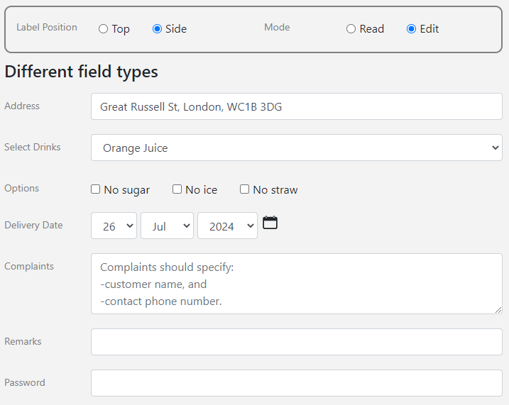
#Our first example below illustrates a basic usage of fields with the following output:

Visit example.u.team/field to try out the live examples.
value
#If value is omitted, it will be displayed as an empty field.
fields: {
orderNo: {
label: "Order Number",
},
}
orderNo: {
label: "Order Number",
},
}
If value is provided, it will be shown in the input box.
address: {
value: "Great Russell St, London, WC1B 3DG"
},
value: "Great Russell St, London, WC1B 3DG"
},
If value is a number, they should not be quoted, as in the customerNo field.
customerNo: {
label: "Customer Number",
value: 1234567
},
label: "Customer Number",
value: 1234567
},
type
#‘text’
#It is not necessary to specify type: ‘text’ in the schema.
‘select’
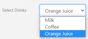
#The field drinks using type ‘select’ that generates a drop list for user selection.

drinks: {
label: "Select Drinks",
type: "select",
list: {
milk:"Milk",
coffee:"Coffee",
juice:"Orange Juice"
},
value: "Orange Juice"
},
label: "Select Drinks",
type: "select",
list: {
milk:"Milk",
coffee:"Coffee",
juice:"Orange Juice"
},
value: "Orange Juice"
},
‘checkbox’
#The field options using type ‘checkbox’ generates checkboxes that allow user selection of multiple items.

options: {
type: "checkbox",
list: {
c1 :'No sugar',
c2 :'No ice',
c3: 'No straw'
},
},
type: "checkbox",
list: {
c1 :'No sugar',
c2 :'No ice',
c3: 'No straw'
},
},
const fieldOnChange = ({ id, key, value, e, call }) => {
switch (id) {
case 'options':
e.target.nextSibling.style.cssText =
e.target.nextSibling.style.cssText === '' ?
'text-decoration-line: line-through;' : ''
break}}
switch (id) {
case 'options':
e.target.nextSibling.style.cssText =
e.target.nextSibling.style.cssText === '' ?
'text-decoration-line: line-through;' : ''
break}}
‘radio’
#The field paid using field type ‘radio’ generates radio buttons that allow user selection of a single item only.

paid: {
type: "radio",
list: {
c1 :'Paid',
c2 :'Not paid'
}
},
type: "radio",
list: {
c1 :'Paid',
c2 :'Not paid'
}
},
‘textarea’
#The field complaints using field type ‘textarea’, that allows users to input multiple lines of text.
hint is provided in this example that will disappear when users start to input.

complaints: {
type: "textarea",
hint:'Complaints should specify:\n-customer name, and\n-contact phone number.'
},
type: "textarea",
hint:'Complaints should specify:\n-customer name, and\n-contact phone number.'
},
‘toggle’
#Field type toggle will generate a toggle button, like an on/off switch as shown below.

urgent:{
type:'toggle',
value:false
},
type:'toggle',
value:false
},
‘datepicker’
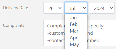
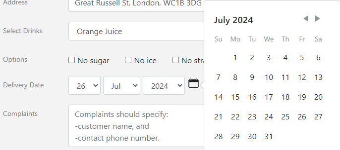
#Field type datepicker allows users to select dates in two different manners.


date:{
label: "Delivery Date",
type: 'datepicker',
value: '26 July 2024',
},
label: "Delivery Date",
type: 'datepicker',
value: '26 July 2024',
},
Fields in Multiple columns
#To allow fields to display in multiple columns, Field works with the responsive grid from React-Bootstrap.

<Row>
<Col>
<h6>Default label width</h6>
<Field id="orderNo" no={2} />
<Field id="paid" no={2} />
</Col>
<Col>
<h6>Custom label width</h6>
<Field id="customerNo" labelWidth={[5, 7]} />
<Field id="urgent" labelWidth={[2, 8]} />
</Col>
</Row>
<Col>
<h6>Default label width</h6>
<Field id="orderNo" no={2} />
<Field id="paid" no={2} />
</Col>
<Col>
<h6>Custom label width</h6>
<Field id="customerNo" labelWidth={[5, 7]} />
<Field id="urgent" labelWidth={[2, 8]} />
</Col>
</Row>
Input Validation
#Event Handlers
#There are two event handlers fieldOnChange and onKeyPress to handle field updates events. @anchor:onfieldchange
fieldOnChange
#const fieldOnChange = ({ id, key, value, e, call, api }) => {
switch (id) {
case 'labeltype': call('changelabel', key); break
case 'isRead': call('changemode', key) ; break
case 'options': e.target.nextSibling.style.cssText =
e.target.nextSibling.style.cssText === 'x' ?
'text-decoration-line: line-through;' : ''; break
} return true }
switch (id) {
case 'labeltype': call('changelabel', key); break
case 'isRead': call('changemode', key) ; break
case 'options': e.target.nextSibling.style.cssText =
e.target.nextSibling.style.cssText === 'x' ?
'text-decoration-line: line-through;' : ''; break
} return true }
fieldOnChange is triggered upon Field change with the following parameters:
id: string
ID of the Field being changed.
key: string
For select, radio and checkbox fields, this is the key of the item being changed.
value: string
For text or textbox fields, this is the value of the Field being changed to.
e: object
Raw HTML DOM event object.
call / api: function
Function to trigger the dispatch actions.
onKeyPress
#const onKeyPress = ({ id, char, value, e, call, api }) => {
if (char === 'Enter')
alert(`Enter pressed on field '#123;id}':\n#123;value}`)
}
if (char === 'Enter')
alert(`Enter pressed on field '#123;id}':\n#123;value}`)
}
onKeyPress is triggered upon each key pressed. The parameters are same as fieldOnChange with the following added:
char: string
Character of the key pressed.