YAML CRUD
In this tutorial, we will generate a table grid with a popup input form to demonstrate more comprehensive applications of YAML, including the incorporation of customized scripts.
app.yaml
#For each package in application, there is at least one YAML file to define all the menu, routing and components. The default file is app.yaml which is located at .../tutorial-react/packages/yaml-crud/app.yaml in this tutorial.
The following is the header section of this tutorial:
header:
name: Crud
template: "@uteamjs/template/react-redux"
src: src #Output directory
# Index Template
module: crud # Module name
index: index.js # Index file name
# Route Setting
routeName: routeCrud
routePath: crud
defaultPath: contact
route:
- detail/:id?: detail
menu:
- Contact List: contact
name: Crud
template: "@uteamjs/template/react-redux"
src: src #Output directory
# Index Template
module: crud # Module name
index: index.js # Index file name
# Route Setting
routeName: routeCrud
routePath: crud
defaultPath: contact
route:
- detail/:id?: detail
menu:
- Contact List: contact
For more comprehensive discussion on YAML file structure and header syntax details, please refer to YAML Overview.
Component
#contact
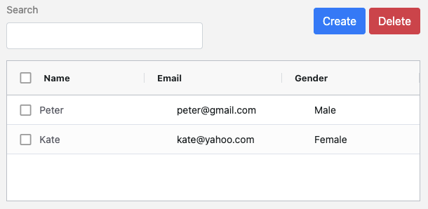
#The parent component contains a search field on grid items, two buttons and a grid table.
In YAML, a component container starts with its component name. In our case, it is ‘contact:’, which is the same as the contact declared in Header above.
This contact component has two container elements Columns and Grid.
contact:
- Columns:
...
- Grid:
...
- Columns:
...
- Grid:
...
Columns
#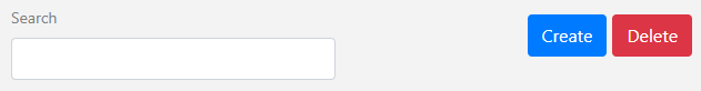
There are two containers Fields and Buttons under the Columns element:
- Columns:
- Fields:
- Search:
labelPosition: top
onChange: gridQuickSearch
- Buttons:
- Create:
href: '#/crud/detail'
- Delete:
variant: danger
click: >
() => call('delete', getSelectedRowID())
- Fields:
- Search:
labelPosition: top
onChange: gridQuickSearch
- Buttons:
- Create:
href: '#/crud/detail'
- Delete:
variant: danger
click: >
() => call('delete', getSelectedRowID())
Fields
#Under Fields container are list of field elements in either one of the formats below:
<field label>
Field label without semicolon. The value is empty by default.
<field label>: <field value>
Field label with field value. No property is specified.
<field label>:
<property name>: <property value>
Field label with list of properties. The field label and property name are at the same indent level.
labelPosition
top means placing the field label on top of the field. If omitted, the field label will be placed on the left side of the field.
onChange
Call the built-in gridQuickSearch function which in turn calls the gridapi.setQuickFilter of Ag-Grid.
Buttons
#Properties under the two buttons Create and Delete:
href
Define the route path of the detail page in the form of #/<routePath>/<route>
The route is defined in the header section.
click
Call the delete action with the rows selected. gridSelectedRowID() is another built-in function to retrieve row items selected.
variant
The Bootstrap danger variant for button.
For more details, please refer to Button section of YAML
Grid
#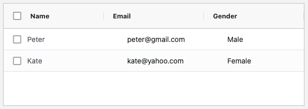
The above grid is defined by the following YAML scripts:
- Grid:
props:
checkbox: true
resize: true
fit: true
col:
- label: id
hide: true
- label: Name
route: crud/detail
params:
- id
- Email
- Gender
row:
- 12345, Peter, peter@gmail.com, Male
- 23454, Kate, kate@yahoo.com, Female
props:
checkbox: true
resize: true
fit: true
col:
- label: id
hide: true
- label: Name
route: crud/detail
params:
- id
- Gender
row:
- 12345, Peter, peter@gmail.com, Male
- 23454, Kate, kate@yahoo.com, Female
props
#Grid properties are specified under the props element. There are three optional Grid properties:
checkbox
true - provide a checkbox for each row.
resize
true - allow resizable column width.
fit
true - Fit in the container width when loaded or refreshed.
col
#For each item under col, either format below is allowed:
<column label>
Column label only, without semicolon.
<property name>: <property value>
...
List of key:value properties.
Properties under column label:
hide
true - hide the columns. In this case the ID of each row.
route
Route path to detail page which clicked.
param
Column id which is supplied as parameters to the route.
row
#Row data for grid table initialization. This is only used in prototyping, since row data will be loaded from the backend in the real case.
List of row data are specified under the row element using comma-separated format
- 12345, Peter, peter@gmail.com, Male
- 23454, Kate, kate@yahoo.com, Female
detail popup component
#You will get a similar form popup after pressing the above mentioned Create button or pressing a name (with route specified) in the above mentioned Grid.
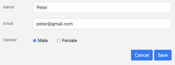
This popup form is initialized in the YAML detail container as a separate component. The name detail matches the name detail under route in header section.
The detail form consists of four fields and two buttons:
detail:
- Fields:
- Id:
hide: true
- Name:
- Email:
- Gender:
tp: 'radio'
list:
- Male
- Female
- Buttons:
- Cancel:
click: >
() => goBack()
- Save:
click: >
() => {
call('crud-api/contact/add',%_fields%)
goBack()
}
- Fields:
- Id:
hide: true
- Name:
- Email:
- Gender:
tp: 'radio'
list:
- Male
- Female
- Buttons:
- Cancel:
click: >
() => goBack()
- Save:
click: >
() => {
call('crud-api/contact/add',%_fields%)
goBack()
}
Properties under Fields:
hide
true - hide the field. In this case the form ID.
tp
Type of field.
list
List of items if tp is radio or select.
Property under Buttons:
click
goBack() is a built-in function calling this.props.history.goBack() provided by React-Router
call('crud-api/contact/add', %_fields%) - %variable% represent getting variable from state object.
Generated files
#index.js
#This file is the entry point of the package generated from YAML.
import { lazy } from 'react'
export const routeCrud = {
name: "Crud",
routePath: "crud",
defaultPath: "contact",
route: {
'detail/:id?': lazy(() => import('./src/detail')),
'contact': lazy(() => import('./src/contact'))
},
menu: [
{
"Contact List": "/crud/contact"
}
]
}
export const routeCrud = {
name: "Crud",
routePath: "crud",
defaultPath: "contact",
route: {
'detail/:id?': lazy(() => import('./src/detail')),
'contact': lazy(() => import('./src/contact'))
},
menu: [
{
"Contact List": "/crud/contact"
}
]
}
The main application can import the routeCrud object to obtain all the necessary information of the generated items.
Note: The full route path is <routePath>/<route> eg /crud/detail/:id?
Addon Javascript Code
#For certain components, custom javascript coding may need to be added on top of the generated files. In this tutorial, we need additional code to handle add and delete action in contact components. The simple way is to modify the JSX file after generation, but the custom code will be overwritten in each regeneration.
We provide a solution to overcome the problem by adding an optional tag - exports under each component. Once an exports tag is added, it will generate two JSX files for that component.
contact:
- exports
...
- exports
...
contact_export.js
#File generated from YAML which will be overwritten in regeneration. Instead of exporting utCreateElement(), two variables _reducer and _layout are exported for contact.js to use. A Content() function is used to render the layout.
import { Button, Col, Row } from 'react-bootstrap'
import { utform } from '@uteamjs/react'
export const _reducer = {
init: {
fields: {
search: {
label: "Search"
}
},
columns: [
...
],
...
},
}
export class _layout extends utform {
...
Content = () => {
...
return (<>
<Row>
...
</Row>
<Grid domLayout="autoHeight" defaultColDef={{
headerCheckboxSelection: isFirstColumn,
checkboxSelection: isFirstColumn,
resizable: true,
}} rowSelection="multiple"
onGridReady={this.onGridReady} frameworkComponents={{
'nameRoute': this.renderColumn('crud-api/detail')
}}
/>
</>)
}
}
contact.js
#Another file will be created once for you to insert the custom code. The delete and add action are added manually in this file which will not be overwritten in regeneration. You need to import two object _reducer and _layout from './contact_export.js' for merging with the custom Reducer and to call from the standard render() function.
import { utCreateElement, utReducer, merge } from '@uteamjs/react'
import { _layout, _reducer } from './contact_export'
import { findIndex, uniqueId, each } from 'lodash'
const reducer = utReducer('yaml-tutorial/contact',
merge(_reducer, {
actions: {
delete: (_, rows) => {
const _rows = rows.map(t => t.rowIndex)
_.rows = _.rows.filter((t, i) => _rows.indexOf(i) < 0)
},
add: (_, row) => {
const _row = {}
each(row, (v, k) => _row[k] = v.value)
if(_row.id) {
const i = findIndex(_.rows, t => t.id === _row.id)
_.rows[i] = _row
} else {
_row.id = uniqueId()
_.rows.push(_row)
}
}
}
})
)
class layout extends _layout {
render = this.Content
}
export default utCreateElement({ reducer, layout })
The following actions are added to modify the state in store:
delete
Update the _.rows array without selected ID
add
Modified existing row record or add new record if ID is null.
Although the script can be put inside YAML, it is more easy to develop and debug by putting in a JSX file.
detail_export.js
#Similar to the contact component, there are two files generated from YAML. Below is the first file which will be overridden during regeneration.
import { Button } from 'react-bootstrap'
import { extractFields, utform } from '@uteamjs/react'
export const _reducer = {
init: {
fields: {
id: {
label: "Id"
},
...
},
},
}
export class _layout extends utform {
Content = () => {
...
return (<>
<Field id="name" />
...
</>)
}
}
import { extractFields, utform } from '@uteamjs/react'
export const _reducer = {
init: {
fields: {
id: {
label: "Id"
},
...
},
},
}
export class _layout extends utform {
Content = () => {
...
return (<>
<Field id="name" />
...
</>)
}
}
detail.js
#import { utCreateElement, utReducer, merge, store } from '@uteamjs/react'
import { _layout, _reducer } from './detail_export'
import { each } from 'lodash'
const reducer = utReducer('curl/detail',
merge(_reducer, {
actions: {
load: (_, data) => {
each(_.fields, (v, k) => {
v.value = k === 'gender' ? data[k].toLowerCase() : data[k]
})
}
}
})
)
class layout extends _layout {
constructor(props) {
super(props)
const { _, match, getState } = props
const { id } = match.params
if (id) {
const data = getState('curl/contact')
const row = data?._.rows.find(t => t.id === id)
if(row)
props.call('load', row)
} else
each(_.fields, t => t.value = '')
}
render = this.Content
}
export default utCreateElement({ reducer, layout })
A constructor() is added to the layout class to trigger the load action when the component is being initialized.
load
To assign the row record into fields’ value.
constructor()
props.match.params.id a React-Router variable defined in route - detail/:id? under the YAML header section.
getState(‘curl/contact') is a @uteamjs/react function to extract state from other components in Redux store.
Once the row is extracted from the 'curl/contact' store, it is passed to the load action to update the state of this component.
Next tutorial: YAML CRUD with backend API integration